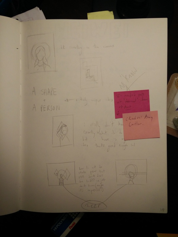
 planning (I want to try to organize my home project posts better rather than like "Home Project 1" but include the year, the approximate time [whether that be which quarter it is or the time period], and the number of the post. I'm not sure how to do this without the title being cluttered) I want to do a painting, and I have several cheap canvasses. I have done planning and begun the sketch on the canvas. 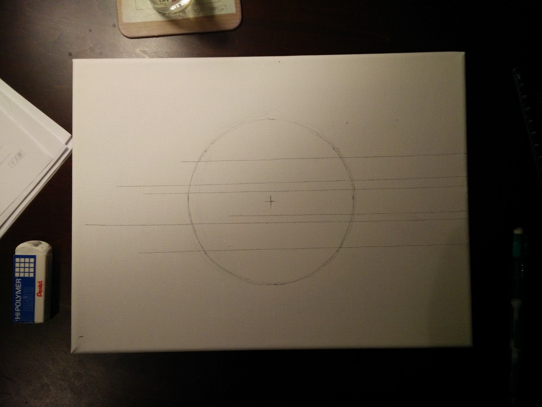 the canvas
0 Comments
I was looking through art I had found in the past, and trying to find one by an artist whose other works I also enjoyed. I ended up finding 36-year-old Korean artist Kim Daehyun, who goes by the pseudonym Moonassi.
To be honest, I really like his work. I was really just looking for someone whose work was interesting enough that I could write about it, but I really quite like him. In a lot of his art, it's hard to understand what's going on; the use of only black-and-white creates odd boundaries between what is shadow, what is light, what is an outline, and what is negative space. I don't want to say it "all looks the same" but it is certainly recognizable - the same kneeling boy(s) show up in a LOT of it. I hope to incorporate some aspect of his work into my future work (something I rarely ever feel when looking at other artists!) I feel like energy is something often striven for in art, but I seek to achieve a rather still feeling. I like the dullness and quietness that comes with an illustration that lacks energy. Moonassi's art accomplishes this in every piece, and even when the subject matter seems dramatic or traumatic, the figures still lack a feeling of energy. I'm very drawn to it. In his artist statement, he says "What I like to create is a drawing as an empty space between me and viewer, so that people can talk and find their own story from my drawings." I don't think this is the reason I like that aesthetic in my own work, since meaning and its reception is unimportant to me, but I like his phrasing of creating an empty space. He's been commissioned by the New York Times to provide art for four different articles. Under the collaboration section of his website, he shares the works that he has been asked to do by others or that he has done with others. He even includes photos of tattoos people have gotten of his work. He's also done several installations. I really hope you'll look through his gallery. I really like it. Amy Cutler's work was recommended to me, and I actually found myself intrigued by her work. I think that, while I like to draw and art is very important to me, I don't have the investment in it that most artists do. For example, in this context, I don't often appreciate other artists' work unless it is personally appealing to me. Aspects like the formal principles and the complex meanings don't often do it for me if the art itself isn't aesthetically appealing. Anyway, coming back from the tangent, I like [some of] Amy Cutler's work.
A lot of it involves women merged with inanimate objects, like boats with women's torsos forming the masts or mountains whose peaks are women's upper bodies. I must admit I'm not a fan of these ones. I like her Her work has an interesting stiffness to it, in that the figures look like they're from a digital 3D model rather than from real people. Their movement looks unnatural and stilted. I'm not sure if I like it or not. Unfortunately, her online presence is TINY, so I couldn't find the title or original source of almost every piece I saw. As a class, we went to see Noah Scalin's introduction of his installation of Maggie Lena Walker at the VCU Business School. Scalin is the school's first artist-in-residence, and their partnership formed in hopes of driving business through creativity. At the "grand reveal" of the installation, Scalin mentioned his motivation for subject choice. Maggie Walker was a successful businesswoman of color, and the first woman to open a bank. She represents the diverse array of students at VCU, he said.
I think the work is really cool. I'm amazed by things like this that only look right from a certain perspective - how do you even think about how to do that? It's very, very impressive. Not only the perspective, but also the color choice is challenging. Using just pieces of fabric, he had to compose a work with shading that works and looks right, and he did. Looks very difficult to me. I don't think my work will be affected by this at all, though. While I find it interesting and impressive, I can't see myself doing anything similar in the future. I'm interested in illustration, and not very interested in color, so a sculpture (installation? sculpture?) like this doesn't apply much to my work, from my view. I am a bit confused on the idea of an "artist in residence." What does that really mean? I assume just an artist that lives at the school and in turn makes art for them. But, then, what is the real advantage to the school? I understand the idea of merging creativity and business, but don't understand the choice to have an artist-in-residence to apply this concept. This progressed smoothly without any time-crunch. There was a period of about two weeks between the finished sketch and beginning inking when I was trying to figure out what pen to use, between my own micron pigma pens, pens in the art room, and various nibs on various ink-dipping pens. I tested several different types on a separate piece of paper and decided on one at the end of the two weeks. Because inking a sketch is a fairly quick process for my drawings, I can afford to spend two weeks simply choosing the pen. I think this project went well.
To be entirely honest, these articles were tough for me to read. I couldn't find much interest in them and at times couldn't follow what "Art in Russia: Under Attack" was talking about. It often jumped from one example to another, without fully fleshing out what it was trying to say about the example. So, to me, a significant weakness of "Art in Russia" is the lack of explanation and clarity of its ideas. However, since "The Art of Controversy" was a transcript of a conversation, it made much more sense to me and I could understand its ideas.
While "Art in Russia" covers the history of art censorship in Russia within the past few decades, "Art of Controversy" discusses the censorship of one particular show. It does mention the censorship of Robert Mapplethorpe's art, relating it by saying it falls within the same struggle. Since I did not understand a lot of the art in "Art in Russia" it's hard to say whether or not I feel that the government was correct in censoring it - however, I can agree with the censorship of "Sensation." They weren't saying the art could not exist, but that it should not be displayed in a public, tax-funded gallery meant to be appropriate to people of all ages. I agree, and think that it was better suited for a private gallery. One question that these readings raised to me is: why is censorship like this dangerous? The expressions are not particularly meaningful. For artists like Ai Weiwei, the censorship is certainly harmful, as he is exposing corruption and cruelty deeply embedded into Chinese government. However, for displays like "Sensation," containing art like portraits made of frozen blood, I don't see real harm in censoring them. Floyd Abrams claimed it was "dangerous, profoundly dangerous" to say that the government has the power to censor offensive things. I disagree, especially in the case of "Sensation" (which Abrams was defending), because it didn't seem that there were any important or effective ideas in the art that the government was trying to hide. So, I wonder how and why censorship such as in the case of "Sensation" is dangerous. |
AuthorKristin Hines - Student artist at Maggie L. Walker Governor's School Archives
June 2018
Categories |
 RSS Feed
