|
Videos of Agnes Cecile painting: https://www.youtube.com/watch?v=e2xR9e8shKE
https://www.youtube.com/watch?v=qWmF-bJj5Xs I love this artist. Her work is so beautiful and relaxing to watch. I really admire her color choices and the way she uses them in unrealistic ways, such as the dripping effects she often puts on her pieces. She can create really beautiful portraiture with interesting feeling behind it. Her precision with watercolor amazes me, because whenever I use watercolor I have a hard time getting it to do what I want in terms of precision. I also really admire her skills with composition and use of precise strokes versus large blotches of color. I think it all ends up looking really nice together. Perhaps someday I could also learn to add abstraction to realism in a way that creates such beautiful composition.
0 Comments
A video of artist Madoka Kinoshita painting: https://www.youtube.com/watch?v=zrZhloeaTp8
I first found this artist about a year ago, I think, but I don't follow her. I watched a few of her videos then and haven't visited her since. I like her color choices. She's extremely good at it - even when her pieces look like she used a glaze or translucent paint, she actually two different colors to appear that way (for example, in the eyes.) It's also really impressive how she can use vibrant colors and paint with such clarity that the final image hardly looks painted, and rather looks digitalized. I hope to someday be as good at colors. I'm not as big of a fan of her style of creating faces, but that is just my personal taste. The way she created the blush was really interesting. It looks airbrushed, but it isn't. I will take note of that technique if I ever need to get finely blended paint without brush strokes. It looks like it works really well. It's also helpful to see how she creates such clean lines without clear brush strokes. Instead of relying on a steady hand, she covers everything else in masking tape cleanly cut to her outlines and then paints over the uncovered areas. I tried to do that last year with my collage piece but I ended up cutting through the paper in a few areas. I'd like to see how she can cut with such precision. I think it just requires practice. We visited Steve Hedburg's exhibition "Full Circle" and Charlotte Culot's exhibition "A Pulsing Heart, Paradise is Now." Hedburg's gallery combined abstraction and realism by incorporating unreal shapes and colors into landscape paintings. He used underpainting, thin layers, and scumbling to create translucent patterns of color and the feeling of depth and energy. He also took care to frame his paintings by painting the sides of the canvases and placing them in frames that best emphasize the energy and feeling of the colors.
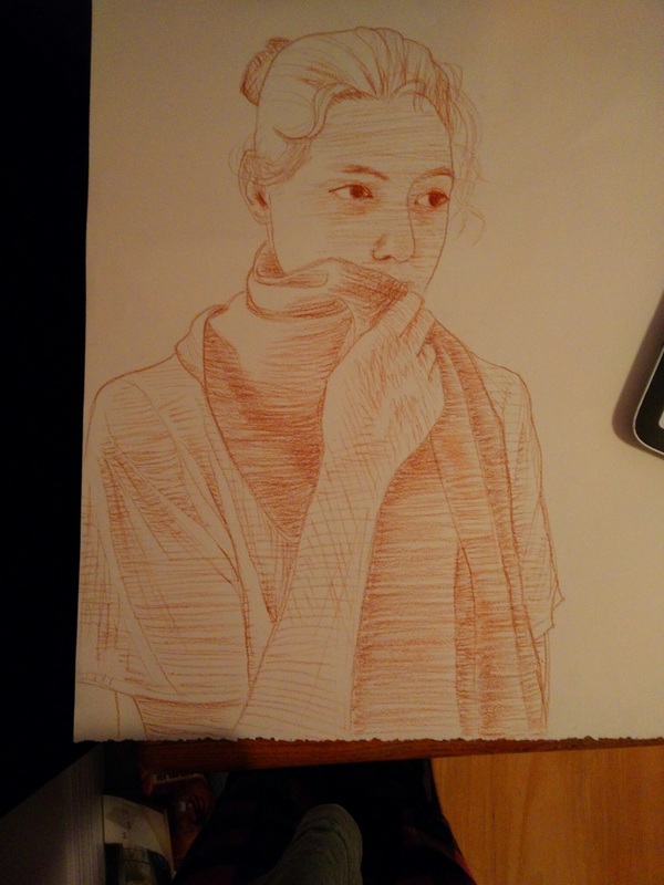
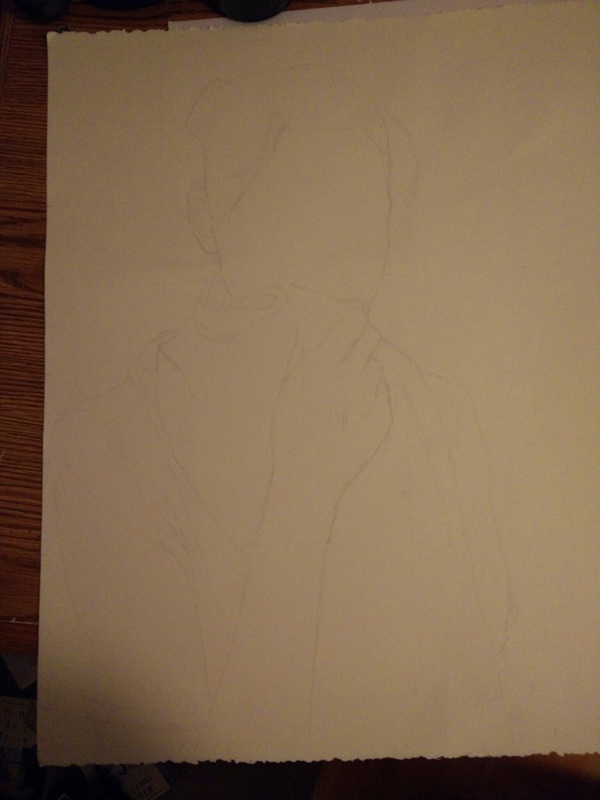
Culot also used layering, but in a very different way. While Hedburg used it to create translucent colors and many overlapping tones, Culot used it to create bold contrasts and differences. However, she often incorporated subtle color changes as well. She also let the paper show through in many works. The straightforward colors she chose typically came from one region of the color wheel, with little variation. She tended to use cheap, everyday materials rather than expensive canvas. Her use of multiple textures allowed for a three-dimensional surface, making the works look different from certain angles. I only really liked the first gallery, to be honest. I loved the textural painting style and the bright splotches of color. It really had a lot of energy. I would like to someday figure out how to choose and capture the right colors so they have vibrant energy but don't clash. I might try to incorporate those thin layers of color that he puts over the scenery, because I really liked it. Culot's work didn't really do anything for me. I gained a bit of appreciation for it once looking closer and seeing the details and subtleties in it, but I still don't really like it that much. The idea of wax resist sounds interesting though, and I'd like to try it out someday to create those subtle variations off color. I'm interested as to how you can hide designs in a piece with those slight changes. 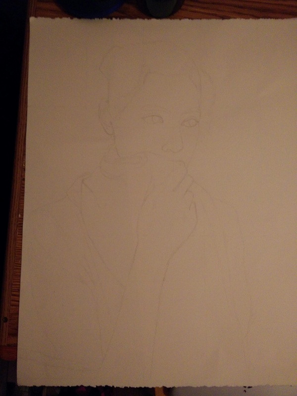 Very unfortunately, I forgot to bring conté home. I finished gridding the face, though. 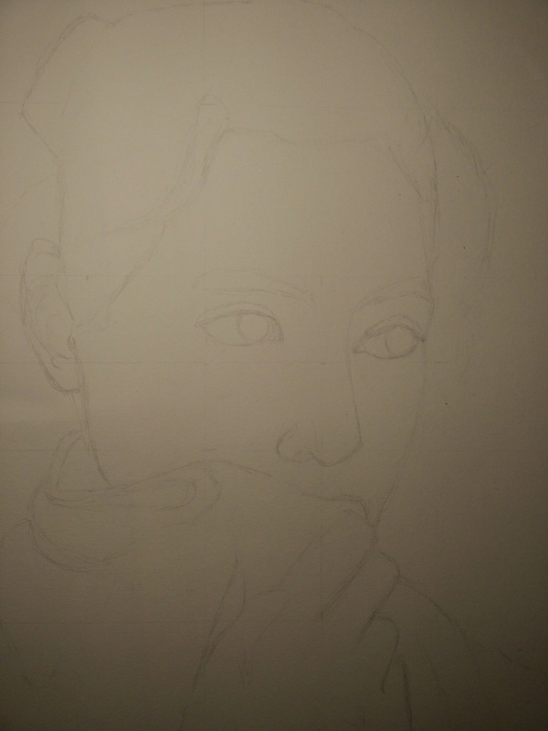  Both articles cover the topic of the role of art in the Cold War. “Propaganda and Patronage in the Cold War” discusses how the USSR and the United States battled with art as their weapon. “Modern art was CIA ‘weapon’” goes into more detail on how the CIA supported this tactic. The claim is that the CIA supported abstract expressionism because it displayed the freedom of the United States, which was looked upon more favorably than the strict socialism of the USSR.
I have never heard about any of this before. The only prior knowledge I had was that the Cold War existed. The topic of a cultural and artistic war never came up. However, everything I read makes sense. I found it funny that the USSR rejected the fantastical, utopian romanticist works while their own social realism was the same. I think their social realism was an attempt at realism while having romanticism at its core, like making a cake but covering it in cheese and pepperoni then calling it a pizza. Both articles struck me as sounding like a joke at first. Joke conspiracy theories often include some far-fetched claim that the government was the cause of something, so hearing that abstract expressionism became popular because of the CIA certainly sounds fake. The second article even addresses this in the beginning, saying it is a joke in the art community. However, as the information is presented, the story unfolds and it actually ties together. Overall these articles provided a surprising insight into the popularity of abstract expressionism. The fact that it’s rooted in a Cold War response to social realism sounds fake. I think the best point was the idea that the apolitical views of the artists added to the effect. I wouldn’t have thought that art created in opposition to nationalism would serve to be the best tool to display the greatness of a nation. These articles provided an insight I hadn’t thought of before. |
AuthorKristin Hines - Student artist at Maggie L. Walker Governor's School Archives
June 2018
Categories |
 RSS Feed
