|
I didn't get a chance to take a photo this week, but we worked with clay to get a feel for handbuilding.
0 Comments
In an attempt to find two artists who connect to each other, I am focusing on Dmitry Spiros in addition to Leonid Afremov.
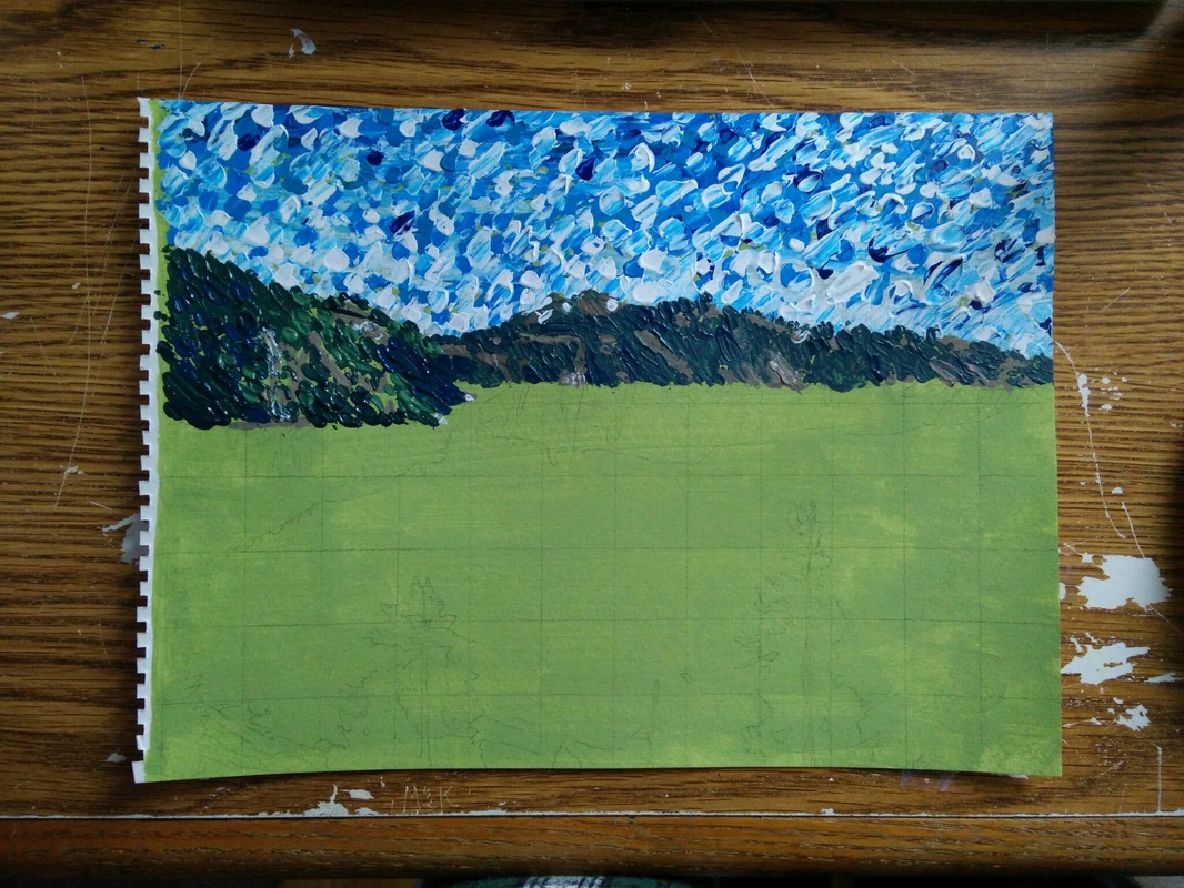
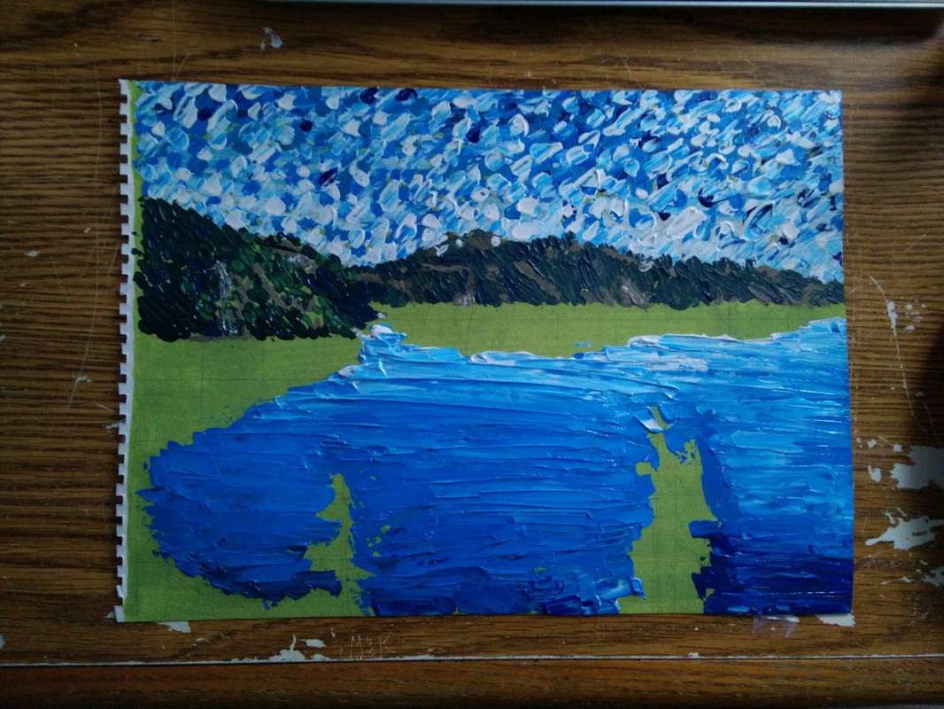
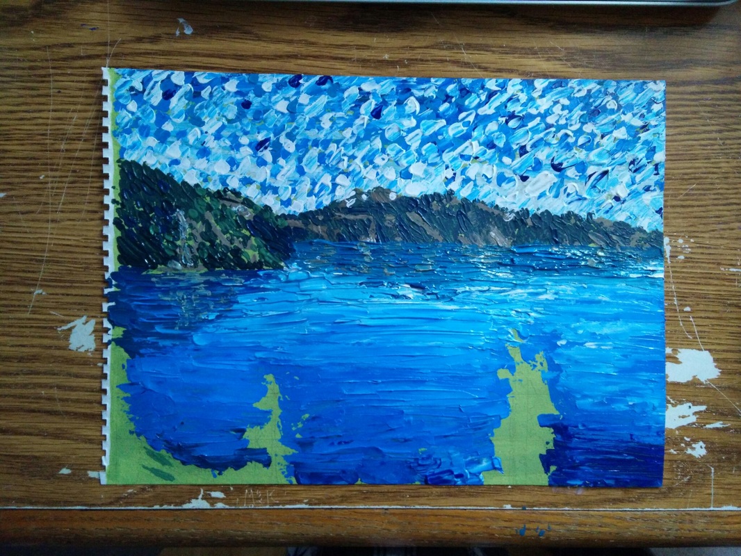
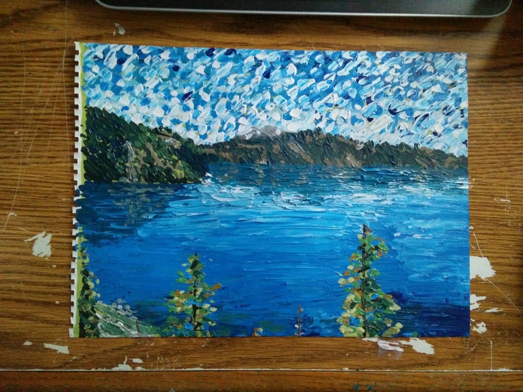
From his website: "The subjects of his paintings are mostly city scenes, genre paintings, the sea, flowers, and portraits. Most of Dmitry Spiros's paintings are created using the medium of the palette knife, oils, and acrylic paint. Spiros is constantly finding new themes, subjects and creative approaches to use." Interestingly enough, when you look up "Dmitry Spiros" on google images, two of the suggested/related searches are "Leonid Afremov Most Famous Painting" and "Leonid Afremov Dancers." After watching this video I drew many connections between Afremov and Spiros. They both tend to incorporate linear perspective, creating a path with nearly symmetrical features on either side. In Afremov's case, it's the trees. In Spiros' case, it's the buildings. They also both use wet, reflective ground to create interesting light. They both also seem to enjoy painting streetlamps. Finally, both the painting in the video and Afremov's popular paintings incorporate small figures into the scene. While the paintings themselves look rather different, they carry a similar feeling and I can see why people associate these artists with each other. They also both majorly use palette knives - Afremov only uses the palette knife, while Spiros uses it for large blocks of color and uses a brush for underpainting/scumbling and fine details. Another quote from his website that bears striking resemblance to Afremov, but in a more urban way - "Bright fantastic paint palette transmit the energy of the city streets, night city parks with lonely lights, cars and passers-by, and the rain in the pictures seem to lyrical and warm... You can see in this section: autumn landscapes of cities, cosy evening streets, the lonely rainy city parks, seasons in urban landscapes executed in the technique - oil on canvas, palette knife." I like the greater sense of realism in Spiros' art compared to Afremov's. While i do like the thick color in Afremov's, Spiros' paintings tend to feel more atmospheric, which is something I'm drawn to. They feel softer and more comforting than Afremov's. The marks are more rounded and gestural than than the quick, squarish marks of Afremov. There's also an interesting texture on "Night City" that makes it look as though you're looking through a glass panel with rain on it, like you're in a car looking out the windshield. I like the feeling his duller paintings give off, but not so much the vibrant ones. Leonid Afremov is the artist I chose to emulate for my landscape painting project. I happened upon him by chance when searching for impressionist artists. Though his painting style can certainly be described as impressionist, he is actually a contemporary artist.
To me, when you search "Afremov" all the paintings look the same. They are vibrant night scenes of a figure or two taking a stroll down a wet, reflective path with streetlights on either side and multicolored trees framing the pathway. However, if you search for specifically different paintings (i.e. "Afremov mountains" or "Afremov portrait", though even searching "Afremov people" results in the same technicolor atmospheres) you can find very different paintings. Interestingly enough, his website (afremov.com) gallery has many varieties of paintings, with the typical vibrant-rain-walk paintings being rather scarce. I guess those ones just tend to be more widely shared on the internet. The most interesting part about Afremov's art is his method. He only uses a palette knife. This is clear in his stroke - they are short and flat smears of paint, rather than strokes with a brush. You can also see his mark in the reflective water - you can tell where he has dragged the palette knife through the paint to create warps in the surface. He has a really good eye for color and light. He can use all the colors of the rainbow in the tree leaves but still leave the painting feeling balanced, like it has order, and not looking gaudy. I think the overriding warm color schemes of the streetlights are the underlying force that brings the painting unity. Here is the video I watched on how to paint like Leonid Afremov: https://www.youtube.com/watch?v=jJkx82yuEZI For an art experience outside of school, I went to the VMFA. I didn't go to a specific exhibit because you have to buy tickets, so I just went for general admission.
The things that caught my eye were impressionist works, because that's what we had been studying. I also saw a piece by Picasso, which is relevant as we just started to study cubism with the Connect reading and the video we watched in class. After doing the impressionist landscape painting, I have a newfound fascination with brushstroke. I find it really interesting to think that the marks I'm seeing were put down by an actual person's brush, that a real person actually painted this. I'm not sure if I'm articulating my thoughts well, but essentially I like the history and real-ness that brushstrokes give to a painting. This is why I have detail shots of many paintings I photographed. I also looked at the landscapes in particular. I also tried to find sculptures to inspire me for the upcoming sculpture project. I have an idea of what I want to do already, but I'm not really sure how to execute it. So, when I found sculptures that I liked, I wanted to photograph them to look at them later. We studied Calder in Art I at my middle school, though I never developed an affinity for his work. I did find it interesting to see and recognize his work at the museum, though. (This is the same reason I photographed the Edward Hopper piece! I recognized it right away.) I found Mucha's "Nature" intriguing, with the coiling headpiece that wraps and drapes around the figure. The flowing movement was very nice to me. Barye's "Pheasant" was just cute to me. There were three versions of it, and the one I photographed was the model, not the final. They all looked like they could be the same sculpture except for small differences. The final was darker and had less color variation than the model, which I found strange. I'm curious as to why Barye changed what he did between the three versions. (I'm wishing I had taken pictures of all of them now.) Degas' horses were intriguing in their strange forms. Both of them kind of give an air of falling apart, which I'm not sure if they literally are or if Degas created them that way. In some horses displayed, there were spaces where the armature was clearly visible. I'm not sure why I'm drawn to the twisty-tiny legs of the Prancing Horse. It's almost like it's decaying. It would be interesting to find out if Degas created them in this falling-apart aesthetic or if they have naturally become this way. (I hoped this article would help but unfortunately I found no answers.) The past three sculptures mentioned were all made out of wax, something I hadn't thought of using before. Overall, this trip was a fun, brief, interesting look at some art I expected to find, and some that I didn't. While it did more for me in terms of aesthetic appreciation ("wow, I like this piece of art") rather than applying it to my work ("wow, I want to emulate this piece of art"), it was still a positive experience. 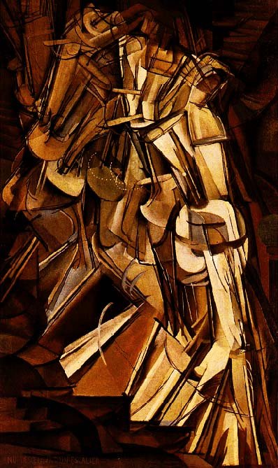 Nude Descending a Staircaise, No. 2  (supposed Neurotic Realism) "The Romanian New Neurotic Realism" I found the article about the Armory Show very entertaining. It was written in a tone that made it an easy and interesting read - not something I normally find. I particularly enjoyed the snippets of criticisms of Nude Descending a Staircase (No. 2) by Duchamp. The fact that people described the painting as "an orderly heap of broken violins," "an assortment of half-made saddles," "an academic painting of an artichoke," and "a pack of brown cards in a nightmare" is really entertaining to me. I also found all of the Gertrude Stein controversy funny, especially the poem and the criticism that ended up sounding like she had written it ("What takes their place is not a sensation at all but a memory, and a memory is not a sensation" vs "You are extraordinary within your limits, but your limits are extraordinarily there.")
I found the comparison to physical stimuli interesting. While one person claimed calling the art sensational was impossible and that they were simply memories, the defending person claimed that calling it "sensationalism" was wise as the art sought to provide a pictorial representation of physical feelings. However, the ugly aesthetic of the pieces still deterred her, like everyone else. I also found the point at the end of the article interesting. It noted that about a century ago, the enraging factor of art was that it was not visually pleasing. However, today, the enraging factor of art are the political and social messages it carries. It also called the old battles "bloodless," implying that today's battles are not. I can see this being true, as nobody was really hurt by people calling modern art ugly (except maybe artist's paychecks, but they were getting tons of publicity) but people can seriously be hurt by people being upset at art with a message. People are assaulted and killed for identify as any sort of minority, whereas I doubt anyone was killed for saying "Oh, that weird art actually isn't too bad." The radical new ideas discussed in the Armory Show article are then tossed around in "The Ism that Isn't." It mentions a point I've thought of much before but never could articulate into words. While this article went through the history of several isms to bring out the point, I believe it did it successfully. The radical modernist art revealed in the Armory Show was radical because it did not abide by "good art rules." The isms article says that the movement was dubbed "cubism" because it was a new idea, and therefore could be labelled an ism. However, because essentially every barrier of "what is art" was broken with modernism and postmodernism, any attempts to dub new isms like "neurotic realism" are just attempts to make history, and do not represent real changes in art history. I am glad this article exists because I have been asked to create a piece that is "debatable art" and was rather frustrated because I believe every barrier has already been broken. No matter how "out there" your art is, it will likely be accepted as art because of how open the community is now to modernist/postmodernist ideas. Overall, I enjoyed these two articles more than usual. |
AuthorKristin Hines - Student artist at Maggie L. Walker Governor's School Archives
June 2018
Categories |

 RSS Feed
